
Resume
GoTo’s portfolio is filled with different cloud-based solutions for communication. When we identified an opportunity to build one for SMBs with focus on boosting their engagement and growth through outbound campaigns, a key requirement stood out: the need for a central platform to seamlessly interact with conversations coming from multiple sources.
Given solutions like our Contact Center offered their own chat-based interface to support staff in distributing and answering their client’s requests, we took the opportunity to combine all conversation platforms together in a single, easy to use interface that could adapt to different needs while still maintaining consistency and cohesiveness.
What
Build a centralized, multichannel inbox experience for the product suite that enables groups of users in different contexts to create, visualize and manage text-based communication.
Why
Engage users by offering a functional and flexible platform that suits different personas and stabilize retention by continuously improving user flows much more easily, avoiding workflow gaps and duplicated code.
Problem
How might we introduce quality unified navigation for our different products addressing their different user flows; mixing VOIP and text-based capabilities, contact information, assignments and reporting?
Business perspective
Enablement: to deliver a product meant for small-to-medium-sized businesses and small scale entrepreneurs, a platform to answer to conversations and manage customer relationships was needed.
Unification: sharing the same visual/functional patterns and maintaining a single source of code allows for easier maintenance and better collaboration among our development teams.
Market patterns: benchmarking shows that other products aiming at similar target groups provide a centralized experience for their users to manage conversations. If we wanted to compete for this market, we needed a on par solution.
User perspective
Navigation: looking at our existing products individually, we could clearly see gaps that forced diffuse navigation on our users when interacting with their customers. Depending on the channel or their preferred point of contact with the company, users would have to go back and forth across different pages to answer requests and document interactions, facing issues like notification overload, lack of visibility and difficulties in reporting.
Discoverability: by having faulty flows, we faced many issues with discoverability and adoption. Our assumptions revolved around customers not even being aware many of our features were available or how would they help their business because of the lack of cohesiveness and guidance in the product.
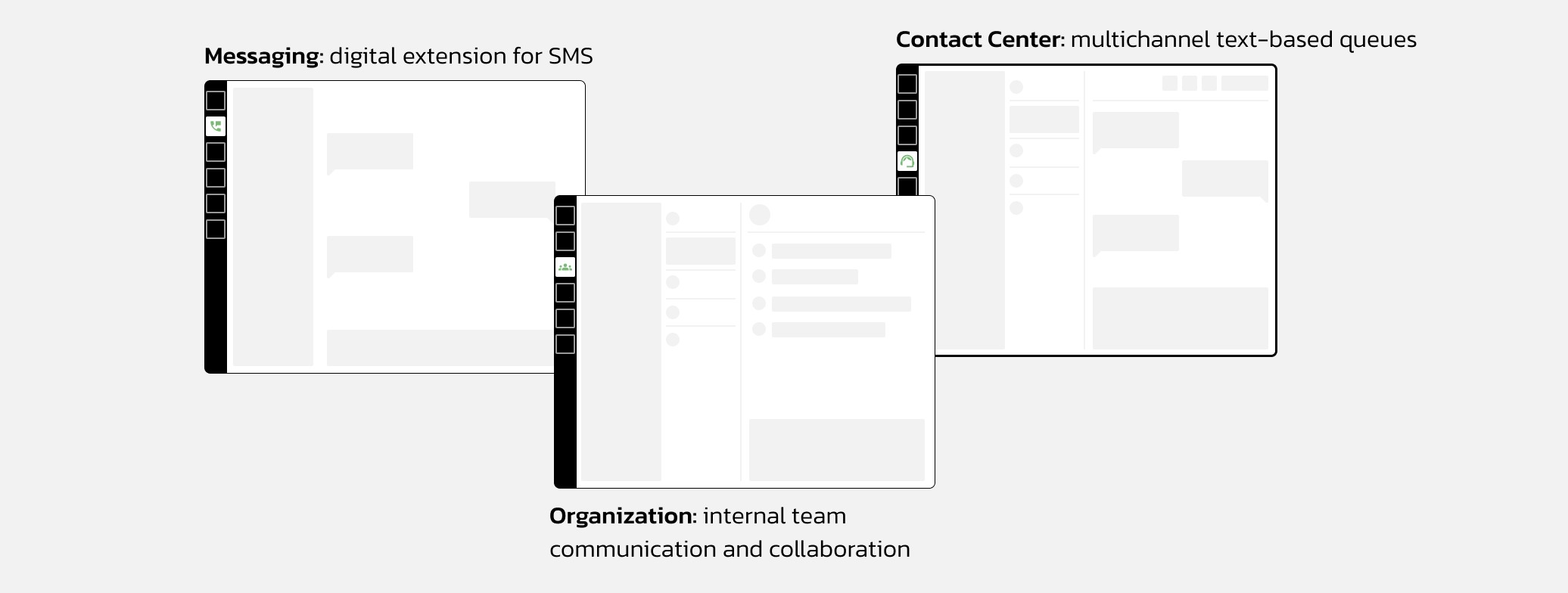
Illustrative sketches of how different text-based experiences had grown in silos, yet there were similarities between them.
Desk research
For an initial draft on what were the user needs, we rediscovered old interviews and noted down some preliminary insights on their pains and needs associated with text interaction when assisting a client. Being a naturally more robust solution for customer experience, Contact Center was a good start if we wanted to think of scalability for our Inbox. Some of our findings:
-
#1
Users do a lot of multitasking. By offering one place to visualize and take action on all conversations, we help them save time and avoid mental strain.
-
#2
Prioritizing information displayed is crucial to be effective, users think more about the topic of conversations than from which channel it came from.
-
#3
Focusing on a contacts as opposed to channels helps users because it allows for more contextual conversations with transparency over previous interactions with them.
Our group of three UX designers presented these to our Product and Engineering peers so that, as a bigger group, we could define the next steps in order to expose opportunities, share understanding of the problem statement, ideate on possibilities together and write down assumptions to be validated through user research.
We conducted different sessions after that, adding or restricting the list of stakeholders as we needed to broaden our ideas or define them. Crazy-8s helped us include different perspectives in our thinking for MVP, proto-personas and their user stories helped us structure the qualitative research we were preparing for and different exercises of prioritization helped us picking what should be our scope.
Qualitative user research & co-design exercise
With an exploratory script formulated to explore their journeys, we gathered 6 participants that helped us validate our assumptions and redefine our priorities. We decided to also combine it with what we called a “co-design” exercise which consisted in having a digital whiteboard set up so we could ask users for their input into an ideal interface that could help solve their multitasking problems. With a tablet at hand, we were ready to draw low-fidelity sketches, materializing an interface in real time while allowing them to play around with their ideal hierarchy almost as if we did a moderated card sorting exercise together.
Solution
Prototypes
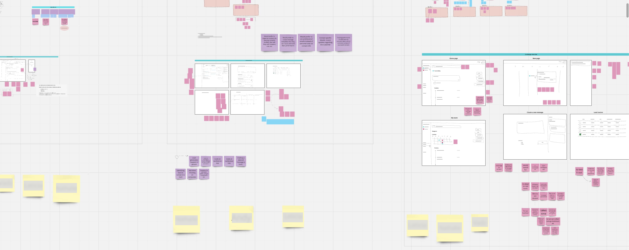
Using what we learned during research, we identified some patterns that pointed which would be the most important elements of the UI to different types of users. That led us to a series of explorations and many group sessions to bring new ideas, analyze benchmarks and discuss options.
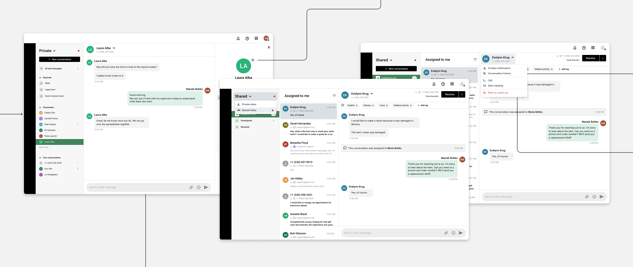
Illustrative extracts of the MVP prototypes we ended up with.
Our prototypes kept evolving after our initial launch, always taking in the user groups’ feedback and adapting the flows to their needs. It's still a vital piece of our software, assuming increasingly important roles to our different personas and tackling their needs. With new channels and capacities added, we are always revisiting its UI and going through the design thinking cycle of learning, ideating, prototyping and studying our impact on our users lives.